|
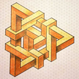
When developing new products, one of the critical tasks a designer has is getting the client to understand what the proposed concept would really look like. Shown a static 2D image some people struggle to interpret what it may look like in 3D. This is not surprising as there are many interpretations as to what could be happening in an image. We have all seen “optical illusions” in which we are tricked thinking what is out is in, up is down, and curved is flat. If designers are also so easily tricked, how can they expect people not trained to think in 3D to visualise the new concept? At that how could we expect anyone to interpret what the hidden sides of a 2D image looks like? In a recent project we worked on this issue was really evident on a number of levels. First off, the graphic design company, whom the marketing department worked closely with, was commissioned to provide the initial visual direction. This company is amazing in producing product graphics, labels and branding, but unfortunately all their work is in 2D. They provided front view “realistic” 2D images that were approved by marketing and send on to me to “make real”. Our first task was to interpret what had been presented, and after mulling it over for a while, we had to call the graphics company to confirm our interpretation was correct. We then had to bring some reality into the picture, as in creating a shaded 2D dwg you can fool yourself into designing shapes that aren’t possible, or cannot be manufactured. We then modeled up the proposal in 3D CAD and using a 3D file format (in which the object can be rotated and viewed from multiple angles) sent it back to the graphics company to see if their “static” realistic 2D and words had actually conveyed their intent. We were close, but even using their image as an underlay for my 3D, proved to be a bit inaccurate. The project continued and we were getting great feedback from the graphics and marketing department that we were on the right track. We had got almost to the sign off stage when it happened. Marketing finally discovered that the files we had been sending could be rotated and viewed from any angle, not just the default “static view” it was saved at! What we interpreted and the graphic guys had intended as flattish panels, marketing had interpreted as generous curves! We were back to the beginning, but now thanks to “3D” were all able to see the same thing! But seeing on screen and making the mental leap to how big or small the part really is, or what it would feel like in your hand is an even more difficult feat. Leveraging the same CAD data used to produce the 3D files, we were able to commission rapid prototypes that were almost true to life and confirmed that what the team has imagined. From this project quite a few lessons can be learnt;
They say a picture speaks a thousand words, but a 3D files speaks millions Graphic courtesy of clipartxtras.com
1 Comment
|
AuthorGary Bortz, Director of Bortz Product Design Categories |
